 Sam’s Choice Coffee
BRONZE
Brand: Sam’s Choice
Retailer:Walmart
Country: United States
Category: G3. Packaged Goods
Agency: Anthem
Summary:
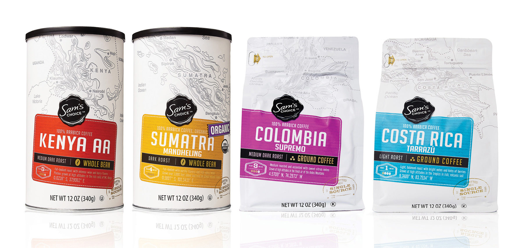
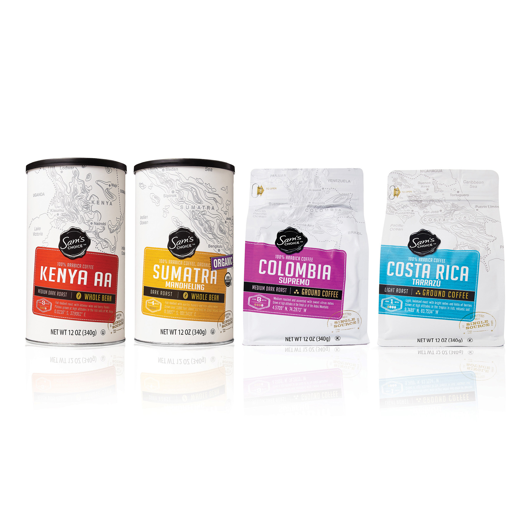
Sam’s Choice Coffee design uses a clean white background to pop on shelf, where competitive packaging is mostly dark and busy. It also stands out with a matte finish that’s easier to read than typical gloss finishes. The white canvas includes small hits of black and bold, youthful colors to communicate flavor. This helps the brand stand out on shelf, and creates a powerful family effect. The color makes it easy for consumers to shop based on flavor, while the release number and taste profile communicate small batch.
The topographical map illustration and co-ordinates create a sense of provenance and ‘authentically sourced.’ The coffee comes in two different formats – canisters for whole beans and bags for ground beans. The Sam’s Choice Coffee design also includes a spot varnish for the brand logo to help it pop, along with gold, metallic ink on certain features for a more premium feel.
Credits:
- Creative Director: Helena Yoon
- Design Director: Tracey Ujfalussy
- Account Director: Bernadette Sheppard / Leigh Waycaster
- Walmart Design Lead: Sarah Paskell