 Member’s Mark Organic Milk
SILVER
Brand: Sam’s Club Member’s Mark
Retailer: Sam’s Club
Country: USA
Category: G1. Fresh
Agency: Equator Design
Summary:
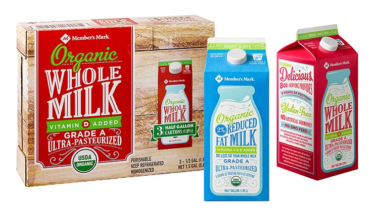
The Sam’s Club organic milk design needed to stand out and communicate its wholesome attributes on pack, particularly to the core demographic of health-conscious moms. In order to articulate a friendly and healthy product that builds buyer confidence, our design establishes a unique personality. Inspired by traditional farmers’ signage to indicate provenance and evoke a “fresh from the farm” sense of heritage and quality, hand-lettered typography in the style of a farm sign placed inside of an old-fashioned milk jug ensures that all of the product benefits are highlighted in an organized way that is both appealing and easy to read. Color is important in this category for differentiation between milk fat content, so these conventions were woven into the background and typography color palette. Because this three-pack carton is sold in club stores, we were able to continue the “fresh from the farm” inspiration onto the outer case: the wooden planks from milk jug crates are “painted” with a panel that has vintage farm-stand charm.
Credits:
- Designer: Erica Johnstone
- Creative Director: Michael Duffy
- Account Manager: Malia Jollenbeck